
While you won’t be able to appreciate it at this moment, the title of this post is actually a clever (if I do say so myself) play on words to a lab that was recently performed in my AP Biology class. The focus of this lab was to get a better understanding of the way predators and prey interact within a specific population. That’s where the Lynx and the Hare come in, by the way. (Now do you see the cleverness in the title?) These two animals were the focus of the lab- though many would contend that it resembled a game more than a lab (you’ll see what I mean in a little bit). Either way it was quite fun, and led to an in-depth discussion as to how populations work in real life, as well as what their graphs typically would look like. If you are in the same situation, learning about animals and their interaction in a population, then I would highly recommend doing the following lab!
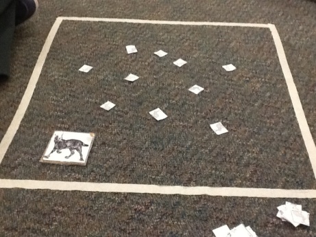
The best part about this lab, in my opinion, is its ability to resemble a game. Many a time would I have to be reminded that I was doing real science, as it is very easy to get lost in the enjoyment of it all. The set up was pretty simple, too. We used tape to mark out a 2 foot by 2 foot square on the floor of our classroom. Then, we placed three paper hares in the middle. Using a square cardboard cut out as our lynx, we proceeded to throw the lynx at the hares. For this experiment to be successful, a few guidelines had to be followed. First and foremost, the number of hares in the population would double every generation. Total, my group ended up doing 25 generations (yes, that did lead to quite a few hares!). Next, the lynx was required to capture (by landing on top of) 3 hares simultaneously to survive. If it was not able to do so in a single throw, then that lynx starved to death. Furthermore, for each group of 3 hares captured by the lynx, an individual offspring was born. (So, for example, a lynx lands on 6 hares, that would be two new offspring). Refer to the picture below to get a good idea as to what the game looked like.
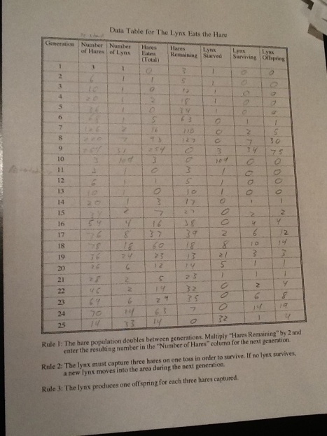
Once everything was set up, and the rules were understood, it was time to start the lab! I’m going to save you some time, and spare you from severe monotony, by not giving you a play-by-play report of every throw we made. Trust me, that would take forever! However, you can see my table of data below. This chart gives you all the information you need to know about the results of this lab, including the number of hares and lynx, how many were consumed, how many died, the amount of offspring, and all of which on a generation by generation basis. Take notice at how the number of hares and lynx fluctuate, and their relationship to each other.
Now I know what you are thinking: that is a lot of numbers, and a lot of information to look at all at once! I understand that it may be quite difficult to understand what exactly is happening. Luckily, my colleague Michael Rees (an extremely intelligent and successful friend of mine) has created a graph that displays the data. It is much easier to see the relationship between hares and lynx using the graph.
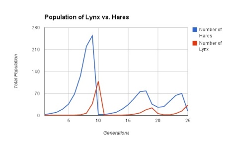
Now compare our results to an actual graph of hare and lynx population sizes. This graph was the result of a real study using real animals in nature.
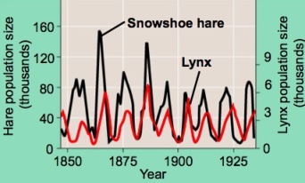
What is interesting about these graphs is that, for the most part, they show the same general qualities. That means that are simple paper and cardboard experiment can model what happens in the real world. How interesting! What is important to see in either graph is how an increase in hare population leads to an increase in lynx population, and inversely, a decrease in hares means a decrease in lynx. Furthermore, you can see how the population fluctuations of the lynx are slightly offset, and later in time, than the hares. This shows that the lynx populations are reacting in response to hare activity.
While looking at statistical information such as this, it is important to understand the different types of graphs that are common among any type of population study. Population graphs can have what is known as a J-Curve, which is characteristic among populations that are rising exponentially (it is uncommon for any population to stay in a J-Curve for a long time, as eventually the population becomes too big). An example would be a graph of human population. An S-Curve is another type of graph in which a population rises dramatically, but then eventually evens out. (These two graphs are, basically, the same thing. The difference is the time scale. This is so because, due to various factors in nature like genetic drift and food supply, a population that is exponentially growing will eventually stable/even out). Types of these graphs can be seen below:
In blue is the J-Curve, and in red is the S-Curve.
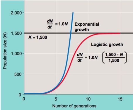
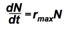
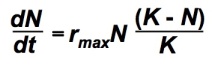
Notice the equations next to the two curves in the diagram? Those are equations used to find exponential population growth (blue) and what is known as logistic population growth (red, which deals with carrying capacity- something you’ll get to in a little bit). For reference purposes only, these equations are as followed. In these equations, d= change in, n= number of individual organisms, t= time, r=rate, and k=carrying capacity.
Population Growth:
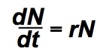
Exponential Growth:
Logistic Growth:
Note: the (K-N)/K portion is a percentage that represents a fraction of the total carrying capacity.
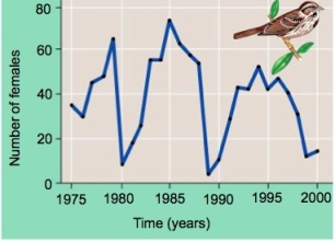
Populations can also be erratic, meaning they rise and fall quite dramatically. An example of this can be seen below. Out of the three types of graphs listed, it is clear that the hare and lynx populations graph most resembles this graph. It is important to note that in populations like this, the number of animals will never stabilize.
One other thing to bring up is the concept of a carrying capacity. The environment can only support so many organisms in a population. The carrying capacity is a term used to describe the limit that a particular environment can withstand. A stable population, such as in an S-Curve, fluctuates around this carrying capacity, while J-Curves grow beyond it (which explains why J-Curves are rare if not impossible for populations for long periods of time).
Hard to believe that a simple game can have so much information behind it, huh? While it may be a lot to take in all at once, all of this is important to understand the populations of animals and how they interact with each other in the real world. This is, you might say, one of the missing lynx in understanding the interactions of animals in the wild!
